Let's have a look at the Mamiya 55mm f/4.5. It's a wide angle lens for the old Mamiya C twin-lens-reflex mediun format system. In the past I've used the Mamiya 65mm f/3.5, which was the other wideangle lens for the Mamiya C, and I was always curious about the 55mm. The focal length is very wide for medium format but the relatively narrow aperture bothered me, but I had to find out what it was like, so here we are.
There were several Mamiya C cameras throughout the system's life. I used a Mamiya C3, one of the earliest. The C3 shoots 6x6cm negatives on medium format film. Medium format is a very different world in which the equipment is big and heavy, the lenses are slow, focal lengths behave differently and the photographers are angry men who despise you. The focal lengths are all different. You know how some digital cameras have a crop factor, and other digital cameras are full-frame? Well, medium format has an anti-crop factor. It has an expansion factor. Because the negative is larger than 35mm. Focal lengths that would be short telephoto or normal on a 35mm camera are normal and wide angle in medium format terms. In the medium format world 80mm is normal, 180mm is short portrait, 55mm is akin to 28-35mm or so, 40mm is about the widest you can get without straying into panoramic or fisheye territory.
In my experience 55mm feels like a narrow 28mm with more at the top and bottom on account of the square format. Contemplate the following image, which shows the full 6x6cm frame with a red box indicating the 3.6x2.4cm outline of a 35mm negative:
If I crop the negative down to that red box the result is a 35mm-sized film frame shot with a 55mm lens, which is what you'd get if you could somehow mount the Mamiya 55mm f/4.5 on a full-frame digital SLR:
Sadly it doesn't go the other way; you can't use 35mm full-frame lenses with medium format gear because the lens-to-film distance is all wrong, and they don't project a large enough image circle to fill the frame. The exception is shift lenses, which are essentially medium format lenses made for 35mm full-frame cameras with a mechanism that allows the lens to shift around the frame, but I'm digressing here.
I like to think that Rick Astley never went away; we are the ones who strayed. He was there all the time. We just had to open our hearts and let him in.
I've written about the Mamiya C before. The system was launched in the late 1950s and remained in production right up until 1994. Uniquely for a twin-lens reflex it was a complete system, with interchangeable lenses, focusing screens, eye-level viewfinders, flash bracket-stroke-carry handles, a special parallax-correcting tripod mount, lots of other stuff. Most other twin-lens reflexes had a fixed lens, usually 75mm or 80mm, occasionally with an accessory optic that screwed onto the taking lens, but none of them were as well-thought-out or easy to use as the Mamiya C.
A 55mm f/4.5, sitting next to a 65mm f/3.5. My 65mm is one of the older, chrome-bodied models. The 55mm was launched later in the system's lifecycle and has a black body. The very last C-system lenses had a blue dot on the shutter cocking lever although I've never seen a photo of a 55m with this dot.
For the images in this post I used the Mamiya C3 on the right. It's over fifty years old but still works. On the left is a Mamiya C33 with the lens removed; the lens is held in place with a bent piece of wire. It's crude but effective.
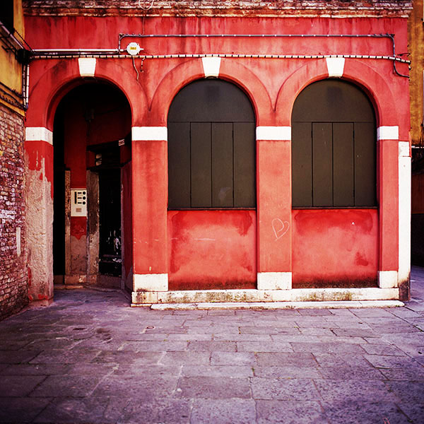
In the shot above the 55mm f/4.5 is set at 1/125th and f/11, which is about right for ten-year-old 100-speed negative film in bright sunshine.
In the shot above the 55mm f/4.5 is set at 1/125th and f/11, which is about right for ten-year-old 100-speed negative film in bright sunshine.
Mamiya TLR lenses had the shutter and aperture mechanism built into them, with focusing done by the camera body. You see the knobs at the bottom of the cameras in the picture above? When you turn them the whole front of the camera slides in and out. That's how the lens focuses, and it can focus very closely, almost as closely as a proper macro lens.
On a mechanical level Mamiya TLR lenses are easy to open up - the front elements usually screw right off - which is handy if you want to blow out the dust or un-gum the shutter. With I think just one exception the viewing and taking lenses were the same, so if the viewing lens has a scratch you can just swap over the elements. In theory the lenses were calibrated at the factory with little metal shims but in my experience any impact on image quality that comes from swapping lenses isn't apparent.
I shoot a lot of film, but I'm not blind to its flaws and limitations. If I could take pictures by blinking my eyes I would do that instead of carrying a camera; the only thing that really matters is the end result.
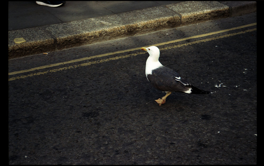
This image does however demonstrate one of film's few killer features, or at least one of negative film's few killer features; it's very hard to blow out highlights. Even if you overexpose a lot, highlights retain some colour, which is terrific if you shoot backlit subjects.
This image does however demonstrate one of film's few killer features, or at least one of negative film's few killer features; it's very hard to blow out highlights. Even if you overexpose a lot, highlights retain some colour, which is terrific if you shoot backlit subjects.
The last and best of the Mamiya TLRs was the C330f, which was launched in the early 1980s. It had some plastic components and weighed less than its predecessors. By 1994 the system was an anachronism - it was an anachronism in the 1970s - but it still sold a trickle of units because there was a niche for it. If you wanted to shoot 6x6 medium format a Mamiya TLR was objectively better than a Holga or a Lubitel; more flexible than a YashicaMat; cheaper than a Bronica SQ; much cheaper (and more flexible) than a RolleiFlex; much much cheaper than a Hasselblad; more reliable than a Russian Pentacon / Kiev, I think I've covered all the bases.
My impression - and I have to say I have no evidence for this, it's just my hunch - is that 6x6 fell out of fashion with camera manufacturers in the 1980s in favour of 645 and 6x7, both of which fit more naturally into magazine pages and portrait frames. By the time digital cameras came along the majority of medium format systems were 645, and even today most medium format digital backs are 645, or cropped 645. I mention this because one thing the Mamiya C lacked was interchangeable film backs; a 645 or 6x7 back might have extended the system's life a bit.
Ironically the rise of Instagram has made square incredibly hip with young people, to an extent that Fuji actually launched a square version of their Instax instant film camera a few years ago, thus demonstrating that the universe is contracting, or that it's a rubber band or something.
What's the 55mm f/4.5 like? Pretty good. There's very mild barrel distortion, but it's easily fixable with Photoshop and invisible unless you're a fan of geometric purity. I tried to shoot at f/11 all the time. At f/11 it's basically razor-sharp across the frame.
I scanned these images with a plain old Epson V500 desktop scanner, by no means the last word in film scanning, so I can't pass authoritative judgement on the 55mm's image quality, but my impression is that wide open it's sharp in the middle with slightly murky extreme corners and from f/8 onwards it's sharp across the frame.
A crop from the top-left, shot at f/11.
f/4.5 isn't as big a limitation as it seems. Mamiya TLR bodies are heavy, and the leaf shutter just goes SNICK (it makes a metallic CHING! sound) and I had no trouble hand-holding it at 1/15th of a second. Weight is nature's image stabilisation.
Wideangle with 6x6 is however problematic. As mentioned in my article on the 65mm, square format forces you to think about framing; if you shoot square as you would rectangular 35mm, you'll end up with empty patches at the top and bottom of the image.
In the next two images I've tried to spread the scene across the whole of the frame, but in the third image there's a big empty space at the bottom, albeit that it would be easy to crop out. Cropping was one of medium format's killer features back when medium format was a thing.
This was shot at f/4.5 - the extreme corners aren't that hot but the middle of the image is fine.
I shot all of these images with some Fuji 160 that expired in 2009. I exposed at ISO 100 and then added a bit more exposure just for good luck. When it comes to negative film, light is a bit like wine - it doesn't hurt to have some more.
An example of cropping. This is a distant view of the Miramare Castle, plus some young ladies who paddled into view. As I stood on the jetty, peering through the viewfinder at a landscape I could never possess and some women I would never have, I contemplated the fact that as men age they become physically repellent, and that even when I was younger all of this was beyond my grasp. And yet I keep going because I am driven by a satanic rage.
This was underexposed. The negative was thin. A leaf has fallen on the car's bonnet. Just in front of the car is a heart-shaped leaf on the ground, aligned with the car's direction of travel. That's the great thing about photography. It's a lot more detailed than real life. You can savour it.
The big problem with the Mamiya C is its bulk and weight. It's awkward to handhold and takes up a lot of space in a bag, and furthermore you need to carry a separate lightmeter. In the 1950s and 1960s photojournalists used twin-lens reflex cameras for news photography but as soon as they were allowed to use 35mm SLRs they switched and didn't go back.
There's another issue as well. The 55mm f/4.5's relatively narrow aperture. Not because of its speed but for the depth of field. Medium and large format photography has a distinctive look. It comes from a combination of shallow depth of field, razor-sharp middle, and zero vignetting. All of this makes the subject pop out, as if it was mounted on a glass plate held in between the camera and the background - or as if the subject was poking his or her face through a wall of water.
Sadly this effect isn't very pronounced with the 55mm f/4.5. The depth of field is such that everything is usually in focus. Sized down to 1000 pixels you end up wondering why you didn't shoot with a digital camera instead, cropping the image square with Photoshop. It's interesting to compare the results with images shot with a Holga, which has a 60mm f/8 lens; the Holga's aperture is even narrower, but the extremely blurry edges mimic the out-of-focus look of medium format so Holga images often end up looking more "epic".
Vesuvius, shot with a Holga
Nonetheless the the 55mm f/4.5 is the easiest, cheapest, most reliable way to get wide angle coverage in 6x6 medium format today, just as it was in the 1970s. It was the widest lens available for the Mamiya C and commands a price premium because of it; the Mamiya C's lens range was small enough that it's not too hard to collect them all, and perhaps one day I will.


